What makes the perfect e-commerce page for Wholesale
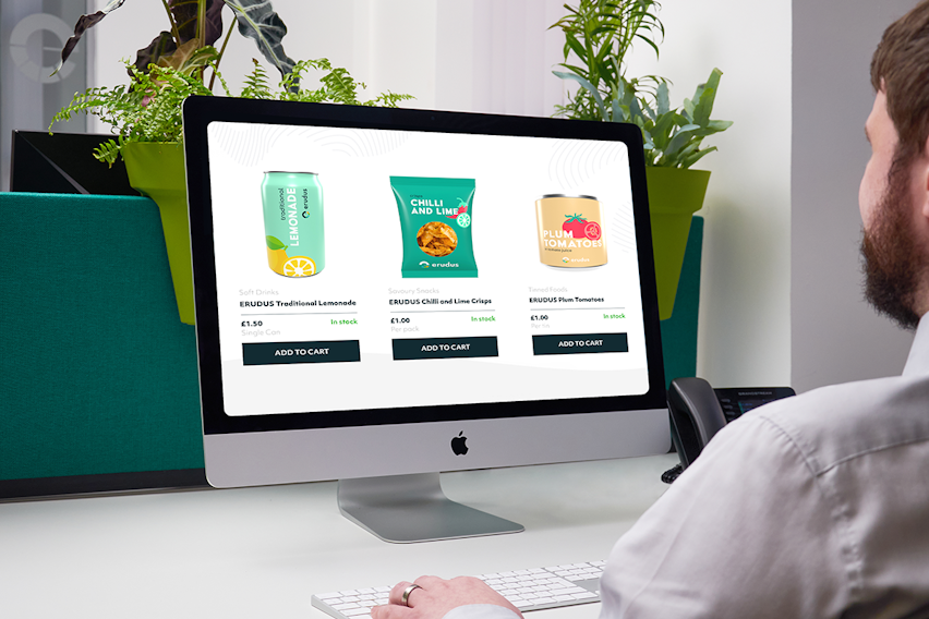
E-commerce is a wholesale gamechanger and our top tips will help your product pages stand out from the crowd…
So, what is e-commerce?
Put simply, e-commerce is selling over the internet. It involves the sale and purchase of products via a website or app. In the case of wholesale, it is generally business-to-business (B2B) selling conducted over desktop and laptop computers, smartphones and tablets.
Why is e-commerce better?
Whilst face to face (e.g. using salespeople) or even telephone selling still have their benefits, there are many more advantages that makes e-commerce an increasingly popular and dominant sales choice. These include:
- Convenience for the customer - ecommerce can be done at any time, day or night.
- Access to insights and data that allow for a better understanding of customer needs - such as finding out which products are viewed but not ultimately purchased, what products customers are searching for and how long they spend shopping.
- Cutting down on time spent answering customer questions such as product availability and information and shipping or delivery costs, which can be listed on the website
- Making it easier for customers to make repeat purchases.
What should a product page do?
A product page isn’t just a page on which a customer can purchase that product, it should also act as a means of persuading the customer to do so - as an advert. Consequently a product page should be designed to perform the following tasks:
- Grab customer’s attention
- Fully describe the product
- Present the product in such a way that makes the customer want to buy it
- Comply with and show off company brand
- Build trust and confidence in the company
- Make the customer want to buy more products from the company
And these are the best ways to get your product pages to do exactly that...
Enriched data from Erudus
The more a customer knows about a product, the more confidence they will have in buying it.
All Wholesalers will know basic information about their products - size, weight, handling information, but with access to Erudus’s enriched data it’s also possible to list attributes such as percentage of waste packaging, allergen content, and whether the product holds any certifications or accreditations.
Not only will such details set you apart from competitors, but their inclusion makes shopping quicker and easier, particularly for the increasing number of Caterers looking for products that fill particular requirements (e.g. products that are gluten-free or suitable for vegans).
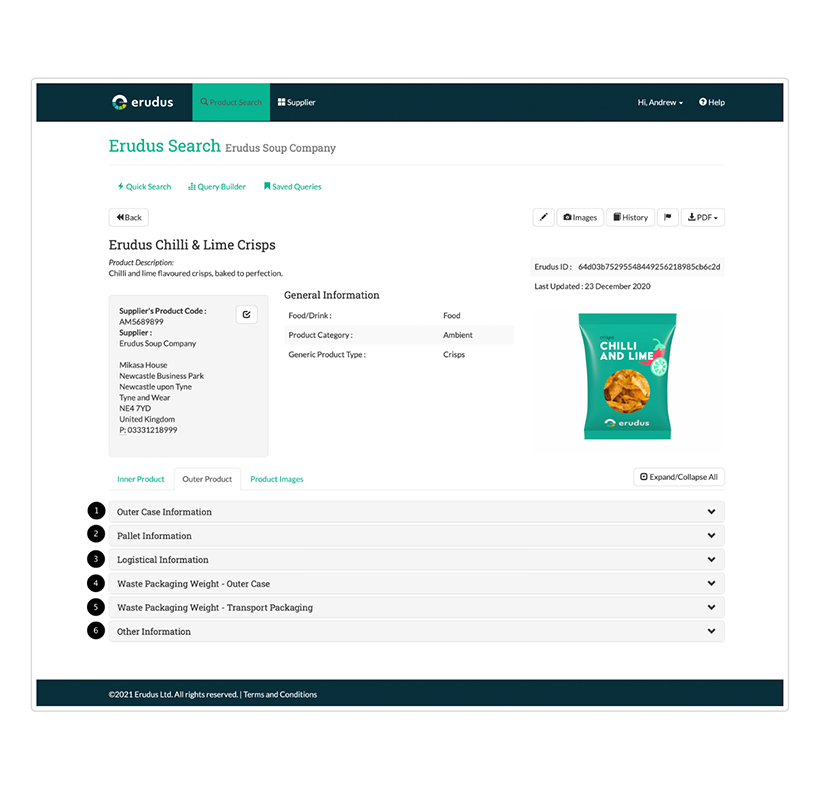
The more product attributes you have listed for each product, the easier it will be to filter the products for customer searches, an important element of user experience when dealing with catalogues as extensive as those of a Wholesaler.
Unique product descriptions
Generic product descriptions might feel like the simplest and easiest option, but the simpler a product description is the more likely it is to resemble descriptions for the same or similar products on other websites, and that is damaging for your page’s overall value (this is the reason you should not just copy and paste descriptions from your suppliers).
Essentially, generic product descriptions ruin your Google rankings, making your website harder for new customers to come across.
But a description that is informative and easy to understand yet in a distinctive tone of voice will stand out to customers and be rewarded by search engines by increasing your organic traffic.
A unique product description can also:
- Help establish your business’s Tone Of Voice - an important part of branding
- Reduce bounce rates and unhappy customers by giving a more thorough representation of the product.
- Allow customers to skim-read and pick out main points more quickly.
- Build trust and authority for the website and company.
- Reduce customers service load by answering questions that might otherwise be directed to Support teams.
What is an example of a unique product description?
“These Italian-grown, juicy chopped tomatoes are bursting with flavour and can be used as the perfect base ingredient in pasta dishes, sauces, pizzas, chilli and vegetarian dishes. Suitable for vegans and allergen-free.”
Use of Schema Markup
Schema markup is the code (or language) that Google uses to understand the content on your website, and decide where and how to present each page on a Search Enging Results Page (also known as a SERP). For example, if you have a product page for gluten-free cherry and walnut breakfast bars, Google will use Schema markup to help decide where your page will sit on the list of returned results (e.g. at the top or bottom) when someone performs a search for ‘gluten-free cherry walnut breakfast bars’ on Google. Achieving a high ranking is very important for attracting customers to your website.
In order to do all of this you will need to add Schema markup into the script of your product page code, and there are several changes you can make to your product pages to enhance the use of Schema Markup.
There are a few ways you can enhance your product pages to ensure they grab attention in the SERPs:
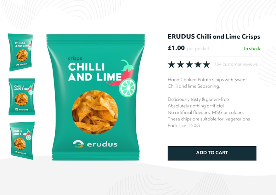
- Ensure the use of structured data that customers will be sure to be looking for when searching for a product - for instance, the price, whether it is in stock and whether previous customers rate it highly.
- Make your product description as unique and inclusive as possible (see above section).
- Including information such as GTINs and skus.
Prioritise good imagery
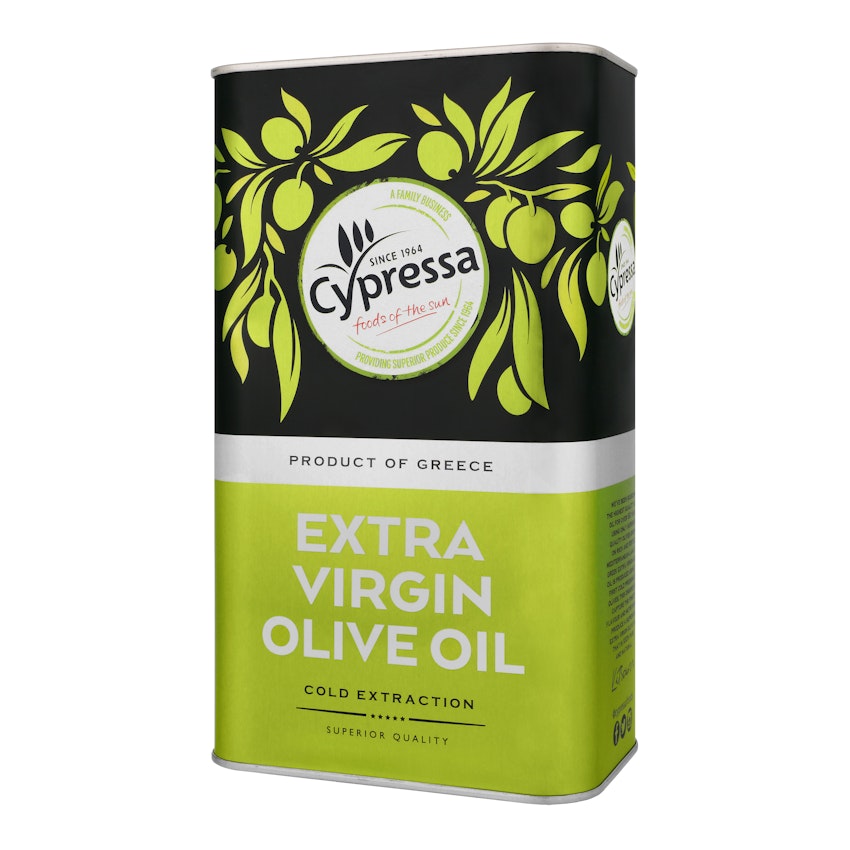
The single most important feature of the perfect ecommerce product page is the product image. They say a picture says a thousand words and a high quality, well shot image not only shows the customer what they are getting, but it tells them the business is trustworthy and professional.
On the flip side, a poorly lit, pixelated (or even worse, completely absent) image is going to put off customers - not just off that product but off your company as a whole.
When it comes to product pages, conversion is the aim of the game, and it’s not just the quality of imagery that leads to conversion, it’s the quantity too. Your primary shot should be eye-level and centred, with a clean white background and no shadows. It should also be supported a small gallery of further shots showing the product from different angles. Multiple product shots are a way of giving customers a better look at the item they are considering purchasing, but they also help to make your website look more legitimate - and consequently more trustworthy.
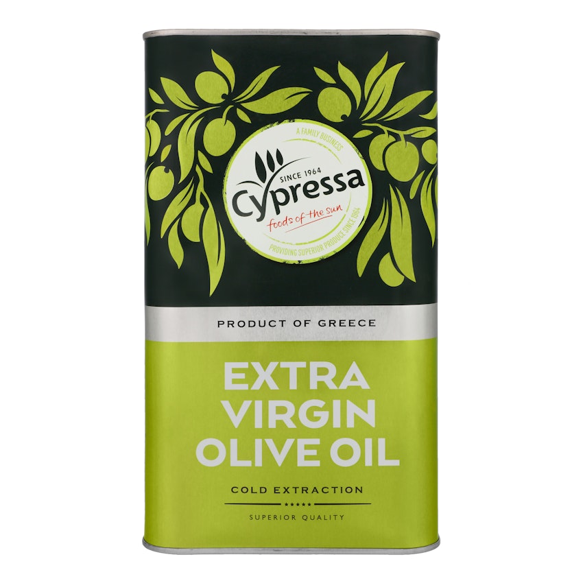
However, you don’t want to go overboard with pictures. It’s important to limit your selection to the amount needed to show off the product to its best advantage - an excessive gallery of pictures not only looks amateur, but it will make the page slow to load and frustrate customers.
Sourcing imagery that achieves the standard needed for the perfect ecommerce product page can be tricky - not to mention expensive, and it’s an issue we witnessed many of our customers at Erudus encountering time and time again. That’s why we launched our Image Capture service, which offers top quality, multi-angled pack and case shots perfect for marketing and ecommerce at a cost that’s affordable for everyone. Find out more about it here.
Use clear CTAs
E-commerce is all about selling, so it’s crucial that product pages make it easy for customers to make purchases. This means putting CTAs (Call To Actions) such as ‘Buy Now’ in prime position, and presenting them as a button rather than simply a link.
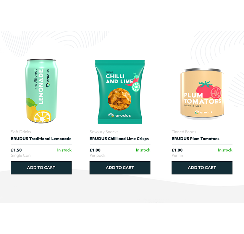
Buttons aren’t just more polished and professional looking, they are what customers have come to expect when shopping online.
It’s also important that the page’s focus remains on the sale, so avoid burying it among banners directing to other areas of the website, pop ups (for example, online chats - these should be placed in a more discreet area of the page such as the bottom corner) and other CTAs such as ‘Read more’ or ‘Subscribe to our newsletter’.
Pay attention to detail
Things like good writing, spelling and grammar may seem unrelated to Wholesale or the art of selling, but without them your website will look unprofessional at best, and unsafe at worst.
Customers are unlikely to order products from and trust sensitive payment information with a company whose website looks amateur and rushed. By putting into the copy on the page, and ensuring it has been thoroughly spellchecked and proofed so that it is consistent and correct you send a message to customers and potential customers that this company is reliable and professional.
Invest in a responsive website
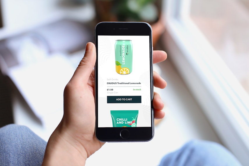
The days when consumers shopped online using their desktop computers is long gone, and when it comes to both B2B and B2C selling smartphones and tablets are where the majority of browsing and a large chunk of purchasing is done - particularly in an industry like foodservice where people spend much of their time in kitchens or on the go.
This means that a website must look good on these devices and it must be easy for customers to make a purchase on them. The way to achieving this is by creating a ‘responsive website’, a website that adapts to the medium it is being viewed on by rearranging and presenting the page so that it is shown to its best advantage - with clear CTAs and full-sized imagery.
If a responsive website is not used, when viewed on a mobile device the product page will simply try to squash everything onto the screen at once so pictures are miniscule and text unreadable. Some fonts may be lost and links broken.
It’s also worth noting that Google separates its mobile algorithm from that of its desktop one, to account for the different consumer preferences.
Post sales experience
Keeping customers is as important as attracting new ones, and the post-sales experience is crucial to customer retention. You might assume that the post-sales experience isn’t something that happens on a product page, but you’d be wrong - there are actually several ways in which you can use your ecommerce page to get the post-sales experience off to a great start:
- Include information about pick-up or delivery - Customers want to know when their order is arriving, and setting out estimated or exact delivery dates upfront both gives customers confidence in the company, and helps them to plan within their own business. In an industry such as Wholesale where the product is perishable this is extremely important.
- Have visible contact information, or even better, an immediate way for customers to contact your business - The ideal solution here is a CTA to start an online chat or instant message service. This is increasingly becoming the most popular choice of Customer Service contact options because it is quick and convenient and customers are able to keep a record of it, and including it on your product page reassures customers that they will be able to get in touch with any worries or questions once they have made the commitment of purchasing.
- Opportunity to leave feedback/review - By allowing customers to review their experience after the sale has been completed you hand them the ability to generate even more sales from new customers. Customers trust each other's opinions more than that of the business itself.
Ultimately, the most important thing a business can demonstrate on their ecommerce page is a commitment to communicating with their customers. Delays, or an absence of communication is a surefire way to lose customers.
Cross-promote similar products
Customers who purchase burgers are likely to want burger buns too, those who want salt may also need pepper and other condiments - a product page is the perfect place to advertise the fact that customers can get everything they need from your website.
Use these product suggestions wisely and sparingly - avoiding galleries of tenuously linked products and sticking only to a few carefully chosen items that genuinely complement the page’s main product, thus showing the expert curation of the website.
Use a clear but non-aggressive heading for these products, such as "You may also be interested in’ or ‘Customers who purchased this also bought..."

